UI Component
Login Component
UI Implementing Login, Sign-Up, and Password Recovery
Overview
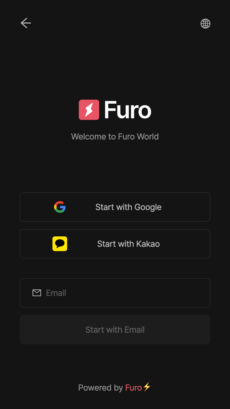
The login component renders a UI for user login and sign-up. The UI options for the component are determined by settings in the console dashboard. You can set the default UI options in the console under the Branding tab, and customize them by passing LoginComponentConfigs when youopen the component.
API
Type
The type of the login component islogin.
LoginComponentConfigs
These are the properties you can pass when usingfuro.open('login').
Options for the login UI. The
appearence attribute overrides the default settings in the console.Determines whether to use a popup window for OAuth login. You can enter
true
or false. The default is true. If set to false, OAuth login will operate
using redirect method.